SketchUp Extension UX Guidelines
The purpose of these guidelines is to help developers design extensions that closer align with SketchUp and to create an improved and unified experience for the end user.
Often it isn’t more work for developers to create a better user experience once you know how. These guidelines along with code examples are intended to even make it easier.
You may choose to deviate from these guidelines. For instance, for an internal tool, discoverability can be sacrificed in favor of efficiency. For a technically complex extension you may want to use a language slightly different to that of SketchUp. If you already have a strong brand identity, feel free to use it. However, we recommend that you familiarize yourself with the guidelines and ask yourself why when ignoring them.
General principles
Language and Tone
Use a friendly, down to earth, not too technical, yet precise language. SketchUp uses self-descriptive English compound words like “Endpoint” instead of the technical Latin word “Vertex”. SketchUp’s original slogan was “3D for the rest of us”, an active stance against the overly technical programs.
Respect the Undo Stack
Undo is a key usability feature allowing the user to experiment with their design. Preventing the user from undoing or redoing as expected can lead to data loss.
One user action should map to one undo step, and vice versa.
Wrap multiple model changes caused by the same user action into a single
operation using Sketchup::Model#start_operation and
Sketchup::Model#commit_operation.
Don’t silently perform changes to the model that are not directly caused by a user action. For instance, don’t write attributes on model load or when your UI is shown, only when the user deliberately makes a change to the model.
Bad:
model = Sketchup.active_model
points = [
  Geom::Point3d.new(0, 0, 0),
  Geom::Point3d.new(1.m, 0, 0),
  Geom::Point3d.new(1.m, 1.m, 0),
  Geom::Point3d.new(0, 1.m, 0)
]
face = model.active_entities.add_face(points)
# Make sure face front side is directed upwards.
face.reverse! unless face.normal.samedirection?(Z_AXIS)
face.pushpull(1.m)
Good:
model = Sketchup.active_model
model.start_operation("Draw Cube", true) # Tell SketchUp to start an operation.
points = [
  Geom::Point3d.new(0, 0, 0),
  Geom::Point3d.new(1.m, 0, 0),
  Geom::Point3d.new(1.m, 1.m, 0),
  Geom::Point3d.new(0, 1.m, 0)
]
face = model.active_entities.add_face(points)
# Make sure face front side is directed upwards.
face.reverse! unless face.normal.samedirection?(Z_AXIS)
face.pushpull(1.m)
model.commit_operation # Tell SketchUp to commit the operation.
Honor Group’s Uniqueness
Most SketchUp users probably think of groups as unique objects. However, when a group is copied in SketchUp, the copy shares a definition with the original. Only once the user enters the group to edit it, it is silently made unique.
For a consistent behavior, silently make groups unique before editing them with the APIs.
Honor Lock State
Don’t modify entities that are locked. The user has locked the entities to prevent accidental editing.
Bad:
do_stuff(Sketchup.active_model.selection)
Good:
do_stuff(Sketchup.active_model.selection.reject(&:locked?))
If your extension edits the contents of a group or component, not just the container from the outside, remember to also check for additional instances outside the selection as these would also be affected.
Exception: Eneroth Hide Locked allows to hide and unhide locked groups and components. Since this is the one and only purpose of the extension, it doesn’t surprise the user. Accidentally hiding and unhiding is also much easier to correct than an accidental move or delete.
Use SketchUp Lengths
Use SketchUp’s own length parsing for user input, and SketchUp’s own formatting for displaying lengths to the user. This makes the extension automatically support all length unit SketchUp supports with no extra work, as well as following the unit settings for individual models.
Bad:
default = "100"
label = "Length (mm)"
title = "Enter Length"
result = UI.inputbox([label], [default], title)
return unless result
length = result[0].to_f.mm
Good:
default = 100.mm
label = "Length"
title = "Enter Length"
result = UI.inputbox([label], [default], title)
return unless result
length = result[0].to_l
Convey Missing License
When an extension isn’t licensed, make sure its menus and toolbars are still showing. Show a message that the extension isn’t licensed when the user tries to interact with it.
If the toolbars and menus are missing, it appears to the user as an installation issue, not a licensing issue. If an error message is shown only when SketchUp starts, the user may have forgotten about it when it is time to use the extension. This is also distracting when you want to use SketchUp for anything other than that particular extension.
Bad:

Good:
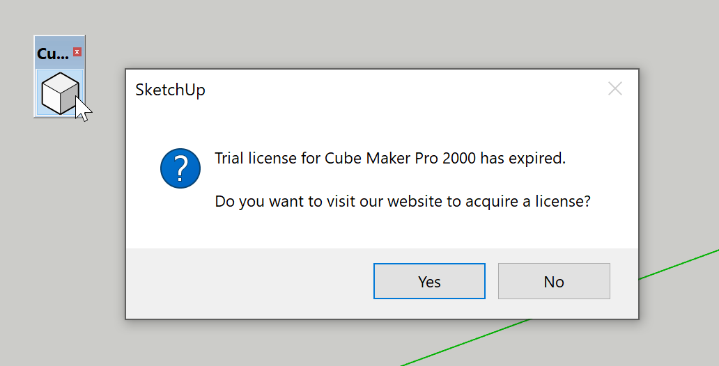
Be Nice In Your Error Messages
Prefer friendly error messages and avoid exclamation marks. You want to help your user getting it right, not yell at them for getting it wrong.
Bad: “TRIAL EXPIRED”
Bad: “No scenes!”
Good: “The trial license for My Super Extension 2000 has expired.”
Good: “Create a scene and try again.”
Link Dialog to Selection
If you can open a UI to edit the properties of a selected object, it feels natural for that UI to stay relevant when the selection changes. A UI “sticking” to an object that has been deselected both risks the wrong object being modified, and can have a subtle feel of being broken.
Good: Entity Info
Good: Aerilius Attribute Inspector
Good: HtmlDialog Examples (Example 5 and later)
Question Your Warnings
If you already know I want to stand here for better reach, why not just design it to support my body weight, instead of slapping a sticker on it?
If you feel the need to warn the user about interacting with your extension a certain way, consider instead making the extension behave the way the user expects by allowing such interaction. For instance, instead of writing “WARNING: Don’t use SketchUp’s move tool to move walls’’, consider making your walls support the Move tool. When phrasing such a warning you have already identified that the Move tool is a natural way to move your walls.
Don’t Scream
If an element is very important, it can be tempting to style it to be more prominent. If several elements are important, this can lead to them all shouting for attention with size and bright colors. Consider the opposite route and instead make the less important elements less prominent, or tuck them away behind progressive disclosure or separate windows.
Consider Using Modus for Your Dialogs

If you don’t have strong brand identity in your extension dialogs already, why not use that of SketchUp? Modus is the UI framework used by SketchUp and various other Trimble products, and helps make your extension feel grounded in SketchUp.
Modus for SketchUp Extension usage guide.
Menus and Toolbars
Prefer the Extension Menu
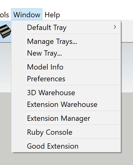
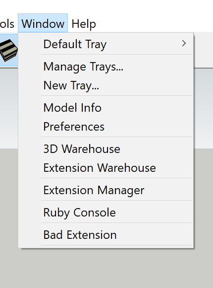
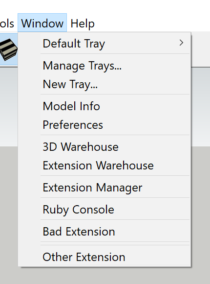
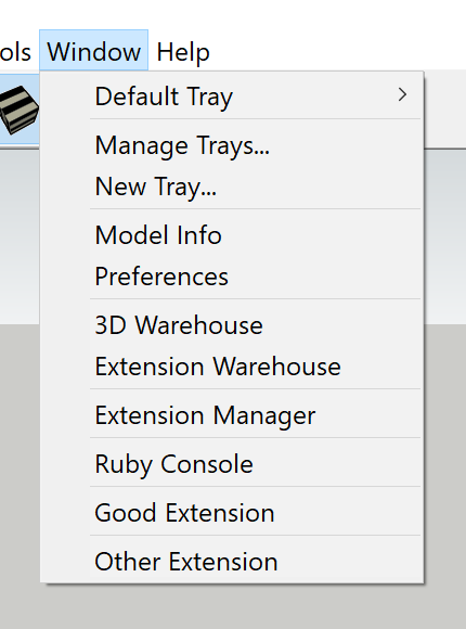
Generally the Extension menu is where users will expect to find functionality added by an extension, not Tools, Window or other menus.
Exception: When an extension adds commands that closely relate to native commands in other menus, it may be good to use the same menu. See Dan Rathbun’s Text & Dimension toggles.
Use Submenus
When adding more than one entry to a menu, group them in a submenu. This prevents the menu from getting impractically long when many extensions are installed.
Don’t Abuse the Context Menu
The context menu (right click menu) is intended for actions related to the object you click. It is not a shortcut for quick access to common actions. This menu is heavily used and experienced users rely on muscle memory to click entries without reading the text.
It can also be a good idea to add a setting for your extension whether it should add entries to the context menu or not.
Have Menu Entries for All Commands
As of now, SketchUp users can only set up shortcuts to menus, not to toolbars. To help frequent users speed up their work, make sure all commands you add to toolbars are also added to menus. Menus are also useful for infrequent users of your extension that don’t want to waste space with a visible toolbar.
Typically add a submenu to Extensions, named after your extension. The same
UI::Command object can be used for both the toolbar and menu.
Minimize Toolbar Size
A SketchUp user may have 10, 50 or even 100 extensions installed. Avoid making the toolbar take up too much space on the screen. Instead of using two buttons for enabling and disabling some property, use a single button for toggling it. Rarely used commands such as Help or About can typically be dispelled to the extension’s menu alone.
Advanced extensions can also have multiple toolbars, e.g. one for the typical user and another one for an advanced task such as content creation.
Omit Extension Version Number
Sometimes developers include the extension version number in the menu entries or toolbar titles. This causes shortcuts and stored toolbar positions to break when the extension is updated and the number changes. Don’t include the version number in menu entries or toolbar titles.
Exception: Sometimes when an extension is rewritten and published as a new separate extension, it gets a number added to its name. This is technically not a version number as it is now a different extension. E.g. CleanUp³.
Capitalization
Use title case for command titles and sentence case for command status bar texts/descriptions. In English title case, all words are capitalized except for small words like “and”, “to” and “of”.
When localizing an extension, beware that capitalization rules differ between languages. For instance Swedish only capitalizes the first word (and proper nouns) also in title case.
Tooltips/Descriptions
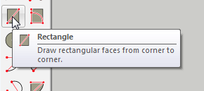
Add a tooltip/status bar text describing in a full sentence what a command does.
Bad: Sandbox Tools
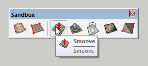
Good: Rectangle Tool
Use the command description to describe what the command does. Don’t use it to tell the user what to do before activating the command.
Bad: Select face.
Bad: Select face and convert to door.
Good: Convert the selected face to a door.
Icons
Try to achieve consistency between your icons while also making them distinguishable from each other (yes, we know this is hard). You can use SketchUp’s own icons as reference for line weight, level of detail and colors.
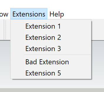
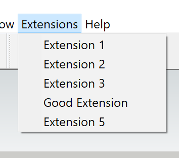
Use of Separators
Never add separators to the Extensions menu. This makes unrelated entries appear grouped together. For grouping your extension’s entries in the Extensions menu, always use a submenu.
Bad:
Good:
In menus other than Extensions, always add a separator before your extension. This prevents your entries from being read as a part of an existing group.
Bad:
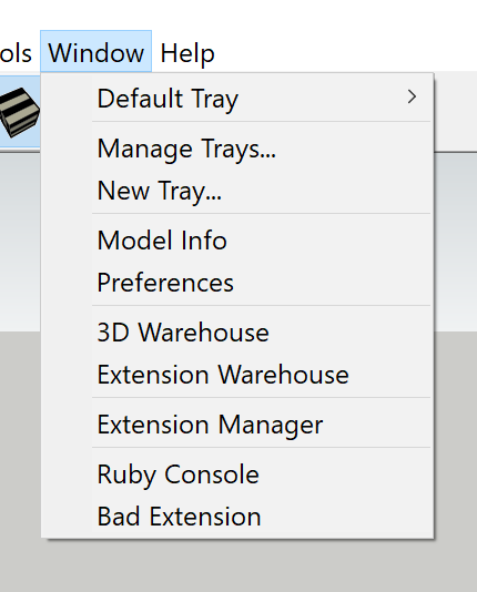
Good:
Never add a separator after your entries. It is up to the following extension to add a separator before its entries.
Bad:
Good:
Tools
Only Call Tools Tools
In a wider context a tool could mean anything you use to get a job done, but in SketchUp a tool more specifically means something that listens to mouse and/or keyboard input (implements the tool interface). Line tool and Circle tool are tools while Make Components and Shaded With Textures are not tools. Avoid referring to commands “tools” when they aren’t.
Use Esc to Reset the Tool
In SketchUp, pressing Esc resets a tool to its initial state.
Good: Rectangle Tool
Good: Example 02 - Custom Tool
Don’t Add UI for Switching to Select Tool
In many programs, e.g. AutoCad and SolidWorks, pressing Esc backs you out of the current tool and into the default tool. SketchUp has no such concept of leaving a tool, only selecting a new tool in its place. By default spacebar is the shortcut for activating the Select tool. No additional way to do so is needed within your tool.
Keep Tool Selected
When an operation is done, reset the tool to its initial state and allow the user to use it again. Do not switch to the Select tool or other tools once an operation is completed.
Good: Rectangle Tool
Good: Example 02 - Custom Tool
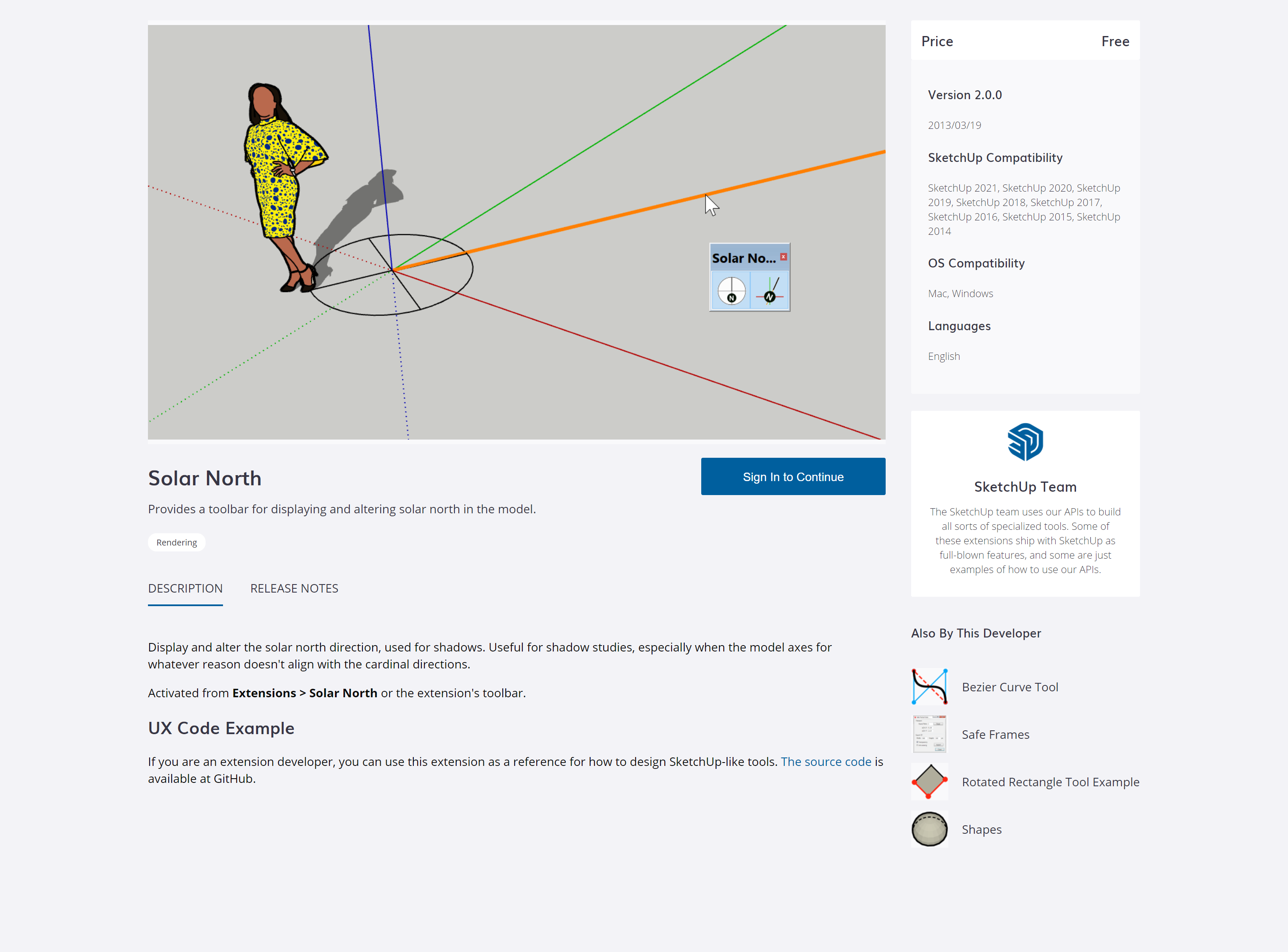
Exception: Axes Tool is almost never used more than once at a time and reactivates the previous tool when done. The same applies to Solar North.
Highlight Active Tool in Menu/Toolbar
When a tool is selected, show its entry as checked and button as depressed in the menus and toolbar respectively. Up to SketchUp 2015 this was done automatically, but now needs to be actively implemented with a validation proc.
Bad: Solar North 1.2.0
Good: Solar North 2.0.0
Use In-Tool Selection
If a tool requires a certain selection to be used, prefer entering a select mode if the tool is activated without such a selection, instead of showing an error message.
Good: Scale Tool
Good: Move tool
Good: Rotate tool
Good: In-Tool Selection Example
Support Tool Pre-Selection
If a tool has a stage for selecting entities, this stage can be skipped if entities are already selected at tool activation. This prevents the need for clicking an object again if it was already selected, but can also be used to for additional functionality.
Good: Scale tool
Good: Follow Me tool allowing a pre-selected rail.
Good: Move and Rotate tool supporting input points outside of the pre-selected object
Good: Eneroth Solid Tools allowing multi-object trim/subtract if these objects are pre-selected.
Use Inference and Inference Lock
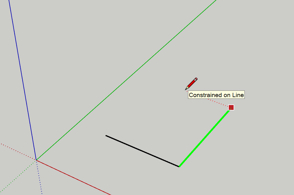
When applicable, allow the user to lock a tool to the modelling axes with arrow keys, or to planes and lines with Shift.
Good: Line tool
Good: Example 05 - Tool Inference Lock
Allow both Click + Move + Click and Press + Drag + Release Style
When drawing in SketchUp, click + move + click puts less strain on the wrist and is generally preferred, but press + drag + release feels more intuitive to some users. By allowing both styles a tool is both ergonomic and easy to pick up.
Good: Line tool
Good: Example 03 - Press+Drag+Release Tool
Use Press + Drag + Release for Optional Advanced Input
In SketchUp drawing is typically done in a click + move + click fashion. However, the initial click can be extended to a drag for additional input, e.g. to select a rotational axis in the Rotate tool.
Bad: Circle tool, Polygon tool
Good: Rotate tool
Good: Curic Mirror
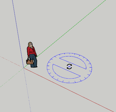
Convey Depth and Direction with Perspective
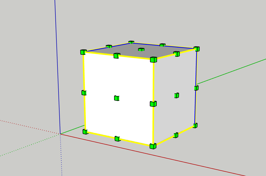
It can be tricky to convey 3D concepts on a 2D screen. Instead of 2D handles in screen space, 3D handles can help convey where in space they are. A 3D circle can convey a plane.
Good: Scale tool
Good: Rotate tool
Good: Solar North
Use the Status Bar
Use the status bar to express what the user can/should do with the tool, as well as what modifier keys there are. Make sure to keep this text as brief as possible to make it effortless to read.
Don’t just state the name of the active tool; this should be conveyed from the toolbar button state.
Bad: “Make unique tool”
Bad: “Press a component to make it unique so you can edit it without editing the other components. Shift makes all copies of this component also unique.”
Good: “Select a component to make it unique. Shift = Make all instances unique.”
Use the Measurement Box
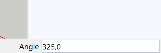
When applicable, allow the user to enter exact numeric values in the measurement box. This allows for higher precision modeling.
Good: Example 04 - Measurement Box Tool
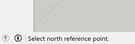
Use the Instructor
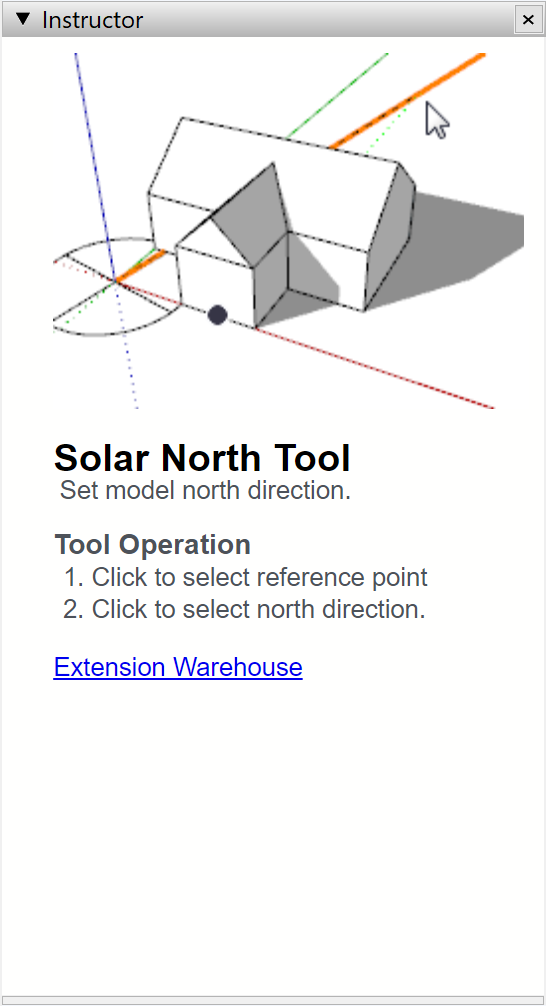
Use the Instructor to give a slightly more in depth explanation of the tool. Include a list of the tool stages, all modifier keys and any alternate workflows here such a pre-selection and in tool selection. Use SketchUp’s own Instructors as reference for formatting and phrasing.
Good: Solar North
Be Scale Agnostic
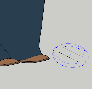
SketchUp looks and feels the same whether you are modeling a chair or a house. For instance, how quickly you zoom and pan is based on the distance to the object you hover and aren’t constant speeds in space. The speed isn’t the same but feels the same, regardless of the size of the object.
Good: Zoom tool moving the camera relative to the distance to what is hovered.
Good: Pan tool moving the camera so that the hovered object stays under the cursor.
Good: Rotate tool protractor having the same screen size regardless of zoom level.
Good: Solar North having the same screen size regardless of zoom level.
Extension Presentation
The Reader
The extension description is read by different people in different situations. Some are under time pressure and have a specific problem to solve. Others are just taking a stroll around the internet in a causal search for new discoveries. With a well structured description you can appeal to both types of readers.
The Important What
What is the extension doing? What problem does it solve on a higher level? If this isn’t absolutely clear from the first few sentences, chances are the user will continue looking for another extension.
The Forgotten Why
Too often it is left out why a certain functionality would be useful. Provide an example or two, and chances are a user that didn’t have a specific problem to solve will still remember the example for the future, or maybe come up with a new idea for a project.
The Overrated How
Often it isn’t very relevant in an extension description exactly how an extension is used. What each button does should be conveyed from its icon, name and hover description. What modifier keys there are in a tool should be conveyed by the status text and instructor.
If such information is provided also in the presentation, make sure to have it below the what and the why.
The Courteous Where
If the user chooses to install the extension, it is courtesy to mention where in SketchUp the extension can be found, E.g. in “Extensions > Solar North”. This is especially true for extensions that have no toolbar but must be located from a menu. Keep this to the end of the description.
Avoid Excessive Formatting
Formatting such as headers, lists and line breaks can be good to structure the text. However, excessive formatting adds noise that makes the text harder to focus on and to read. Use formatting to convey information, and avoid formatting that is purely cosmetic.